

Painting the powder room this weekend was not the easy project I was planning on. Neon red. Neon red was the first color attempt fail. I purchased a pretty coral orange color and in that room it was painfully vibrant. At first I thought it was going to be a pretty color, then as I continued on and the sun started streaming through I felt like I was in a red room of pain. Doesn't help that it's tiny and you can barely move in it. Seriously, this color radiated out of the room like a neon sign. Epic color pick fail. Probably should have helped to read Sherwin William's article: "The Play of Light and Color," especially this part:
"Take the same can of paint and apply it to two rooms, one that receives limited natural light and another that's flooded with sunshine, and it will look and act like two different colors. For example, a warm orange-red paint in a room with a north-facing window will make the room appear brighter and warmer and help offset the bluish cast to the light. However, that same red-orange paint in a room with a west-facing window will become intensely vivid – perhaps overwhelmingly so – in the late afternoon."
The room definitely has a West facing window...whoops! I of course felt discouraged that I wasted my free Saturday painting with a bad color. Dustin went to Sherwin Williams to see if they could tone it down a little, but it was still too similar. This morning I had my mom bring me her peach color from her living room, thinking maybe that direction would be prettier and less vibrant. It was very blah. On one wall it looked like a decent tone, on the other it looked sickly yellowish. Started to feel totally lost on inspiration and went to take a nap (pretty sure the vibrant tone of red haunted my dreams):
 |
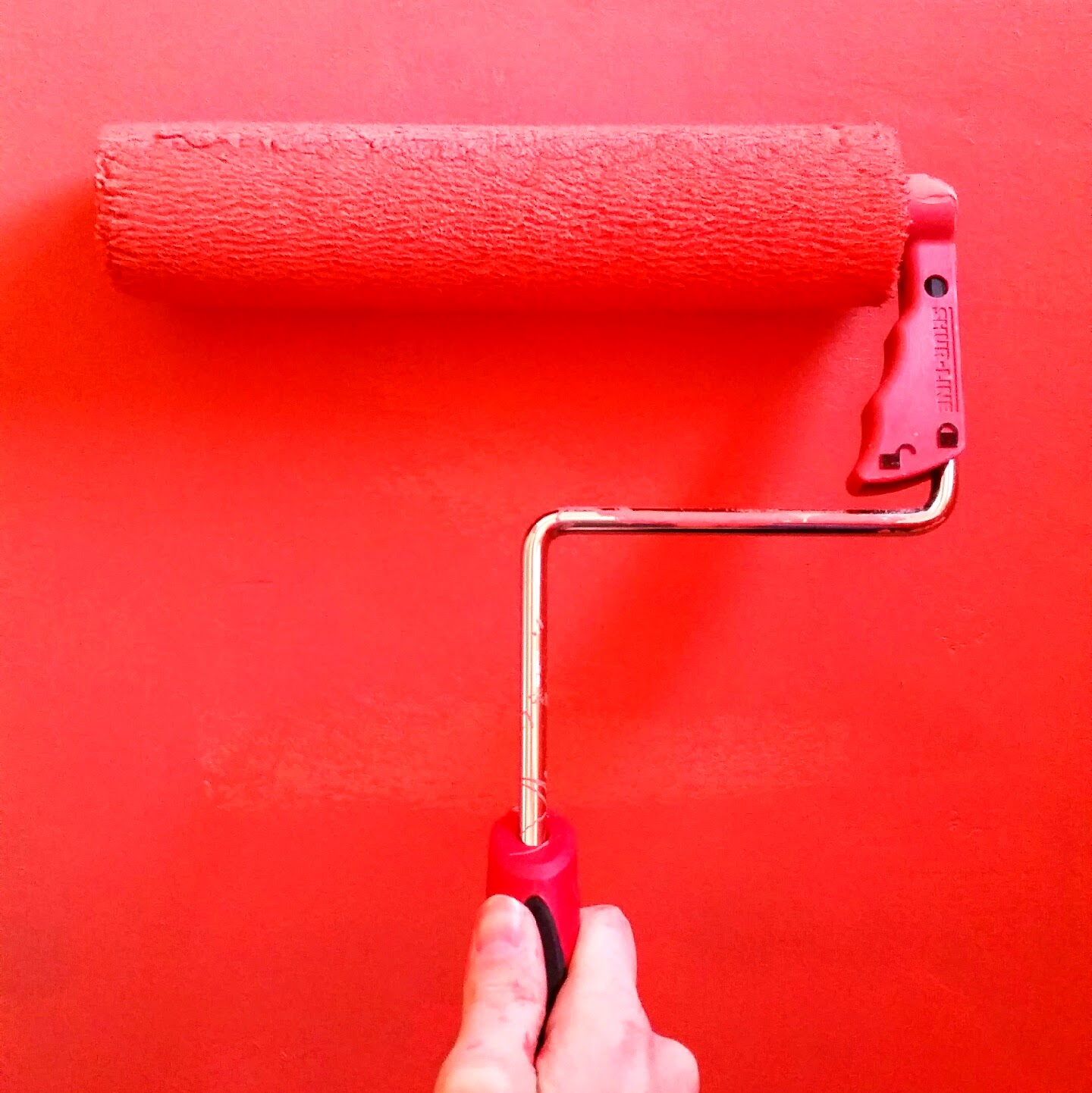
| I wish my phone captured the red glow the room gave off! You can at least see how crazy red and bright it turned out. The lighter color is the peach. It looks ok there because of the red reflecting off, but up close it did nothing for me. |
 |
| Rifle Paper Co. Wallpaper and yes I realize the color above looks nothing like this! Sadly holding my phone up close to it, they are similar...dang color tones and light! |

I had a great result! It made a toned down orange coral that wasn't giving me a headache.


I like to say it went from a violent sunburn to pale to sun kissed! Ok it's still a little burn, but toned down, thank goodness! Dustin and I think painting the light flowers on it will also calm it down a little. It isn't neon anymore which is always a plus and I think it looks good. It will be our warm pop of color room hidden in the kitchen. Need to finish the edges, paint the ceiling (oh yea, originally thought painting it the original crazy red color was a good idea - ugh!) and painting the wood work. Then I can get started on the million flowers I think I can handle painting. With that, we also need to reinforce the floor (another ugh - around the toilet the wood rotted and I can see a small hole through to our basement - not good), lay our gorgeous tile and then put the fixtures in there. On top of that, we were crazy enough to take on fixing our sprinkler this weekend, ripping out the fireplace tile (more on that this week) and have an unfinished island in our kitchen - our house is a mess!!! The weather must have made us a little ambitious...
Happy Easter!
Lots of Love,

No comments:
Post a Comment
I love hearing your thoughts & ideas!